CTK-A2 Media: Unit G324 Advanced Portfolio Coursework
Q1: In What Ways Does Your Media Production Use, Develop or Challenge Forms & Conventions of Real Media Products?
Conventions are the widely recognised way of doing something - which has to do with content, style and form. For an example, the conventions of a music video are, that they are the same length as the song. They show the musicians, who look as if they are singing. They also include the use of fast editing.
For our film trailer, we mostly followed the conventions of an average horror film. For starters, on the start of our trailer, there are a group of girls dressed up in their pyjamas sitting down on the sofa in a dark room, watching TV. A person in a mask then emerges from behind the sofa and spooks them, which we all believed as a group that fits into the convention of horror movies.
Because in most horror movies there is always character(s) that are unaware of what is going to happen to them, which builds up tension and suspense. The rest of the trailer is then a montage of clips showing characters being grabbed, murdered, and corpses. Examples of these could be the kitchen scene of our trailer, shows a character grabbed from behind. Other examples are the bathroom scene of our trailer, where one of the characters is seen being confronted by the murderer and then left for dead. Due to the fact that the murderer is armed with a knife, and the graphic nature that he murders the characters in the film, we classed the film as being a sub-genre slasher film.
The setting of our horror film trailer is a house, which is also conventional, because it is a setting mostly used in horror films. Our trailer also consists of music, and sound effects, which is the main convention of most existing film trailers, as well as horror. Although the music is carefully made or chosen to fit the mood and the atmosphere of the film, since we had make our own music for our film trailers, using apple apps such as; Sound Track Pro, and Garage Band. The process of making the music for our trailer was challenging at first due to the complexity, regarding on what sounds we should use, and keeping everything in rhythm.
The camera techniques we used for our trailer are just like any other film trailer, though we did use some interesting camera techniques such as; first person, which is used in the kitchen scene, where we see from the murderers perspective creeping up towards the unsuspecting victim, before killing her. A technique that we used to challenge real media conventions was in the kitchen scene, again, where we used a first-person perspective of a dead person, looking up. We achieved this by doing a tilted worms-eye view, to get on the same level as the victim.
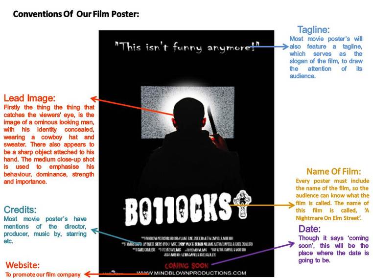
Also, to go with our film trailer we as a group had to produce a front page of a magazine, showing our film, and a poster advertising our film. For our magazine, we still followed the conventions of horror, and conventions of an average magazine, with the usage of
the masthead, cover lines, datelines, and of course, the main image. The name our magazine is called, ‘Slaughter House’. The front of our magazine shows the lead character standing in front of a dark background, with a blank expression on her face, as if as she is unaware of the murderer standing right beside her. For our poster, we still followed the conventions of horror, with the usage of colour scheme and intense font. We also followed the conventions of an average film poster too, for the credits, which is normally displayed at the bottom of the poster, and the font that is written in, which is 'Steel Tongs'. Our reason for chosing this font is to make our poster look as realistic as possible.
For our film trailer, we mostly followed the conventions of an average horror film. For starters, on the start of our trailer, there are a group of girls dressed up in their pyjamas sitting down on the sofa in a dark room, watching TV. A person in a mask then emerges from behind the sofa and spooks them, which we all believed as a group that fits into the convention of horror movies.
Because in most horror movies there is always character(s) that are unaware of what is going to happen to them, which builds up tension and suspense. The rest of the trailer is then a montage of clips showing characters being grabbed, murdered, and corpses. Examples of these could be the kitchen scene of our trailer, shows a character grabbed from behind. Other examples are the bathroom scene of our trailer, where one of the characters is seen being confronted by the murderer and then left for dead. Due to the fact that the murderer is armed with a knife, and the graphic nature that he murders the characters in the film, we classed the film as being a sub-genre slasher film.
The setting of our horror film trailer is a house, which is also conventional, because it is a setting mostly used in horror films. Our trailer also consists of music, and sound effects, which is the main convention of most existing film trailers, as well as horror. Although the music is carefully made or chosen to fit the mood and the atmosphere of the film, since we had make our own music for our film trailers, using apple apps such as; Sound Track Pro, and Garage Band. The process of making the music for our trailer was challenging at first due to the complexity, regarding on what sounds we should use, and keeping everything in rhythm.
The camera techniques we used for our trailer are just like any other film trailer, though we did use some interesting camera techniques such as; first person, which is used in the kitchen scene, where we see from the murderers perspective creeping up towards the unsuspecting victim, before killing her. A technique that we used to challenge real media conventions was in the kitchen scene, again, where we used a first-person perspective of a dead person, looking up. We achieved this by doing a tilted worms-eye view, to get on the same level as the victim.
Also, to go with our film trailer we as a group had to produce a front page of a magazine, showing our film, and a poster advertising our film. For our magazine, we still followed the conventions of horror, and conventions of an average magazine, with the usage of
the masthead, cover lines, datelines, and of course, the main image. The name our magazine is called, ‘Slaughter House’. The front of our magazine shows the lead character standing in front of a dark background, with a blank expression on her face, as if as she is unaware of the murderer standing right beside her. For our poster, we still followed the conventions of horror, with the usage of colour scheme and intense font. We also followed the conventions of an average film poster too, for the credits, which is normally displayed at the bottom of the poster, and the font that is written in, which is 'Steel Tongs'. Our reason for chosing this font is to make our poster look as realistic as possible.
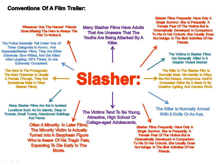
Down below you can see that we produced some conventions diagrams of film posters, magazines, and trailers:
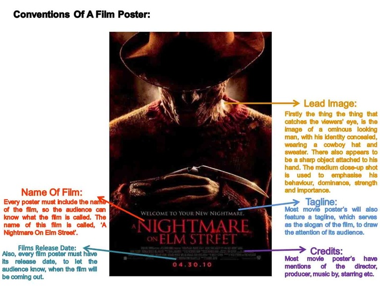
Comparing An Existing Film Poster To Our Film Poster:
For starters, the similarities on the two film posters are; that they both feature an antagonist, whose features have been concealed due to the lighting. The images are both placed at the center. They both feature credits and taglines. The credits are both placed at the bottom. Both posters use black, white, and red, which give the posters a tense, anxiety, provoking atmosphere. The film poster both feature logos of the production companies, and they are both small. Also you can see that the two characters are both wielding a sharp melee weapons. Both of the posters deliberatley show some small features on each of the characters, for an example the existing film poster shows the characters nose, where is our poster shows the character's ears. Both film posters have the titles placed at the bottom. The differences between the two posters are that the 'Nightmare On Elm Street', poster has the image of the antagonist taking up most of the space on the poster, whilst our image of the antagonist does not. There are three different types of fonts that are used in the 'Nightmare On Elm Street' poster, whilst our poster has five different fonts, which makes it less structured. The 'Nightmare On Elm Street' poster displays the date that the film is going to be released, whilst our film poster on the other hand does not. Other differences are that the tagline for our film trailer is placed at the top, whilst the tagline for the 'Nightmare On Elm Street' poster is placed at the bottom. Furthermore, our poster also includes a website, whilst the 'Nightmare On Elm Street' poster does not. The title on the 'Nightmare On Elm Street' poster is coloured in red, whilst the title on our poster is coloured in white. The main font colour on our film poster is white, whilst the main font colour on the 'Nightmare On Elm Street' film poster is red.
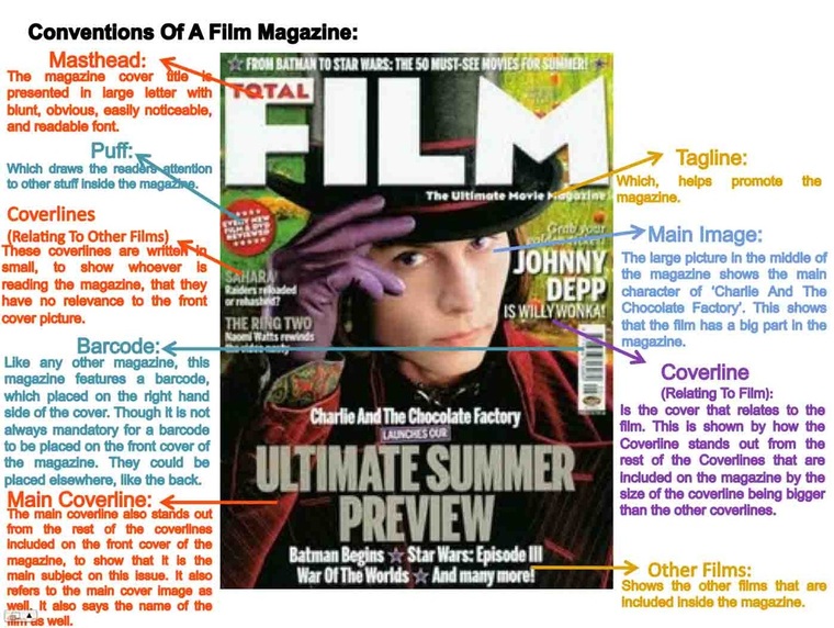
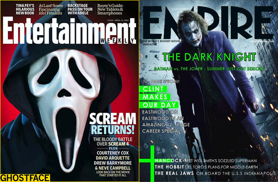
Here are some other examples of magazine front covers we found.
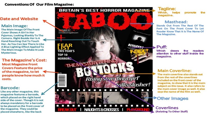
Comparing An Existing Magazine Front Cover To Our Magazine Front Cover:
The similarities between the two magazine covers are; the main images are both placed at the center. Both of the magazines consists of main coverlines. The magazine front covers also feature a barcode. Both magazine's features a puff. Both magazines feature a tagline. Both front covers use bold font. Both magazine front covers have shadows behind the font. Both mastheads of the magazine front covers are both bold, also both mastheads of the magazine front covers have the colour red. A difference between our magazine and the 'Total Film' magazine, is that the main image that is used on the front cover of the 'Total Film' magazine completely takes up more of the space on the front cover of their, whilst ours takes up less. The 'Total Film' magazine also has one image, which is the main cover image, whilst ours have five other small images. The coverline's on our front cover have outlines around some of the font, whilst the 'Total Film' magazine front cover does not. The font is used in the 'Total Film' magazine is alot neater, bold, and also the same font, whilst our magazine does not. The 'Total Film' magazine front cover deliberatley uses varied neutral colours, whilst our group used quite bold and contrasting colours. The coverlines on the 'Total Film' magazine front are all in fixed places and are symmetrical, whilst our magazine front is the complete opposite, for an example the coverlines on our magazine front cover are not parallel and are clustered. The masthead on the 'Total Film' magazine is alot neater than the masthead on our magazine front cover. The colours on the 'Total Film' magazine are more neutral than the colours on our magazine front cover, where we used bold colours, which are; red, black, yellow, and white. Despite having barcodes, the barcodes on both magazines are placed in different places, our barcode is placed on the bottom left of the front cover, whilst the barcode on 'Total Film' magazine placed on the upper right. Furthermore, our magazine front cover features a price, whilst the 'Total Film' magazine does not.
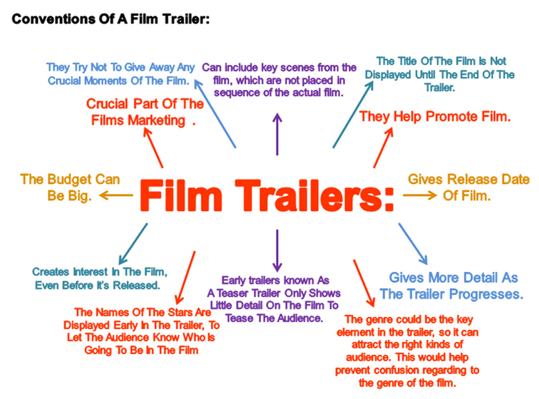
Down below you can see that we as a group embedded the Scream 4 movie trailer from YouTube to show the conventions of a horror movie trailer. It also inspired us to make our horror film, because it is also a slasher sub-genre film.
We have also embedded our film trailer.
The similarities between the two trailers are they're both calm during the beginning. Towards the end of each trailer, the pace of the film trailers begin to speed up. The two trailers both have male and female characters. The two trailers both show the characters being tortured. The two film trailers also show the antagonist, who also wears a mask in both films. The captions in both film trailers zoom in slowly. The captions in both of the trailers are both in a black background, and are written in white. The two trailers feature the name of the films, and their release dates. Furthermore, the two trailers have sounds, that build up suspense, and also sound similar to each other. The end of the trailers show both the name of the film and the release dates. The differences between the two trailers are; The Scream 4 trailer starts off with a message on a green background, relating to the type of audience that should be watching the film. Our film trailer on the other starts off with our production logo being blown up. The Scream 4 trailer shows a caption reading, "In Beginning", before revealing the scenes of the film. Our film trailer however, does not start with a caption, it starts off with someone putting in a DVD, after that a caption then appears reading, "A group of friends..." The Scream 4 movie trailer has alot of fading transitions, whilst ours has a little. The Scream 4 trailer also has some flashing transitions, whilst ours does not. Our film trailer is darker and more agressive than the Scream 4 trailer. Our film trailer ends with the title of our film, along with the date, facebook address, website, and production logo. The Scream 4 movie trailer shows the name of the film, before showing another clip of the film, and then reveals the films release date. The Scream 4 trailer shows more of the movie, and is longer in duration. A difference is our trailer uses mostly eerie sounds, where as the Scream 4 trailer uses music as well.