Welcome To Our Mock Up Section
Here on this page you'll find our mocks ups that we produced. This will give you an example of the layout of how the final product will look.
Our mock-up sketches
FILM POSTER'S
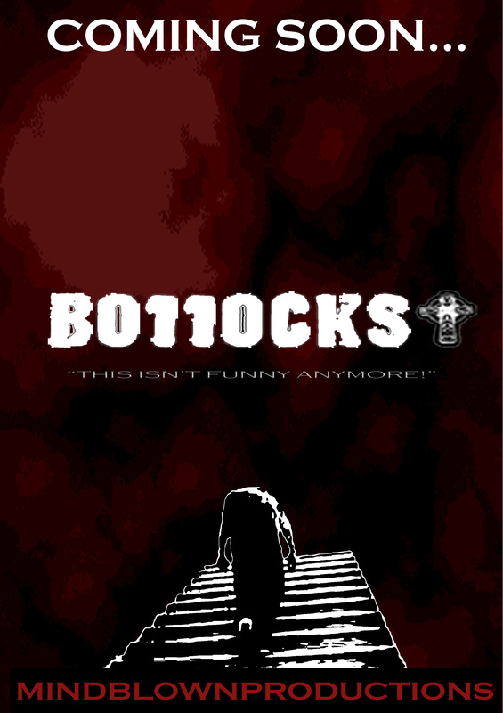
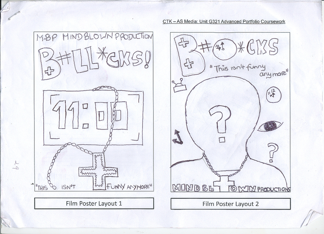
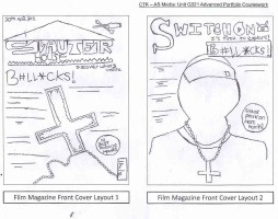
This is the first draft of our poster. I choose to use red and black, because it follows the conventions of horror; red representing blood and black representing darkness and "death". The white against the the background stands out and is very eye catching and bold. The background is portrayed as a "bloody" and mysterious for effect. The title of the film "Bollocks" has "dusty' and "scratchy" edges to illustrate the terror and tension build up of the weapon (knife), being used. The layout is good and the use of space is just like a professional poster.
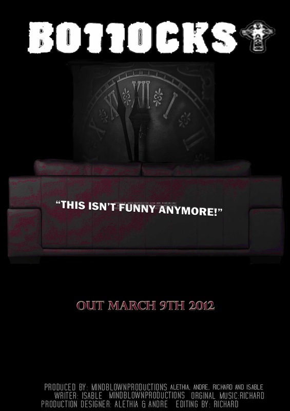
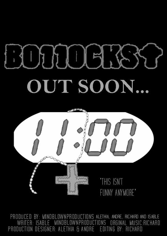
This is the second draft of our film poster. The colour black is used for the background, it is a classic colour used for horror. The the main image used on this poster is a sofa; we used a sofa, because the characters within this film are watching a horror movie in the living room. On the sofa, there is a implication of blood, to represent death within the film. The second image is a picture of a clock, struck at 11 o"clock, which is also is conveyed in the title "Bollocks" - the "LL" is changed into "11". This is a typical structure of how a movie poster looks. One negative thing above this poster is the font of the credit, which was not download, to follow the conventions of a movie poster to look more realistic.
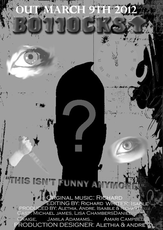
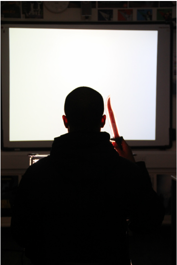
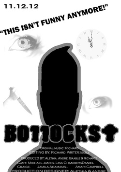
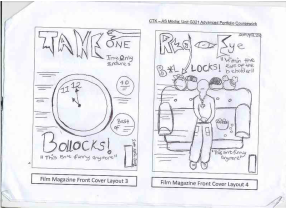
This is the third draft of the movie poster. The colors used are limited to Grey tones, black and white. This creates a gloomy, dull or mysterious effect. The main image is a silhouette of the mysterious killer within the film, hence the reason for no features and question mark. Around the main image are small symbols - the eye represents the character watching tv and the mysterious killer motivation to kill someone, the clock is to portray the time which the killing start and the knife is the weapon used within the film. One negative about this poster is the fonts used and the size of the credits below the image.
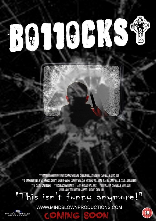
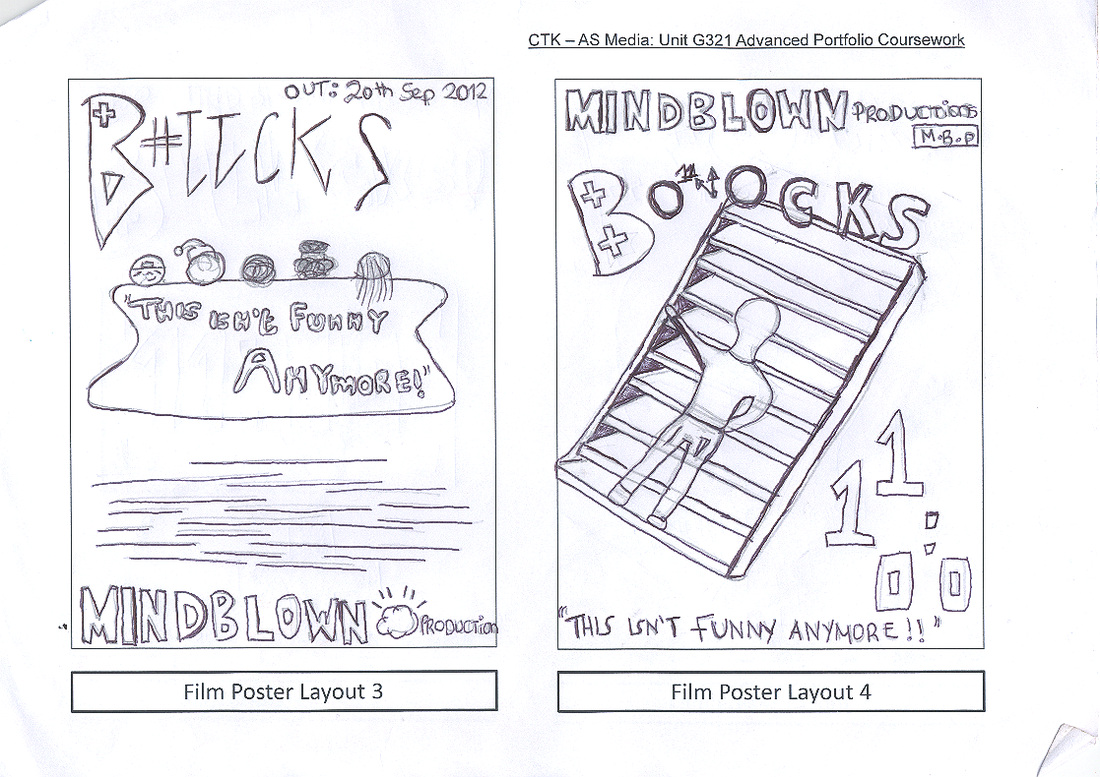
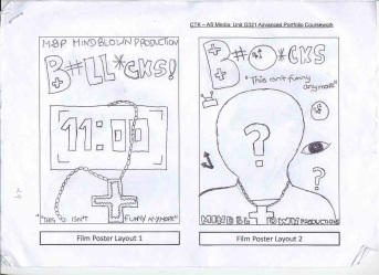
This is another draft of the third movie poster.
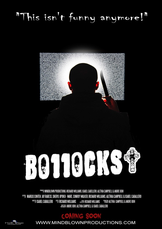
This our forth poster drafted movie poster.
FILM MAGAZINE'S
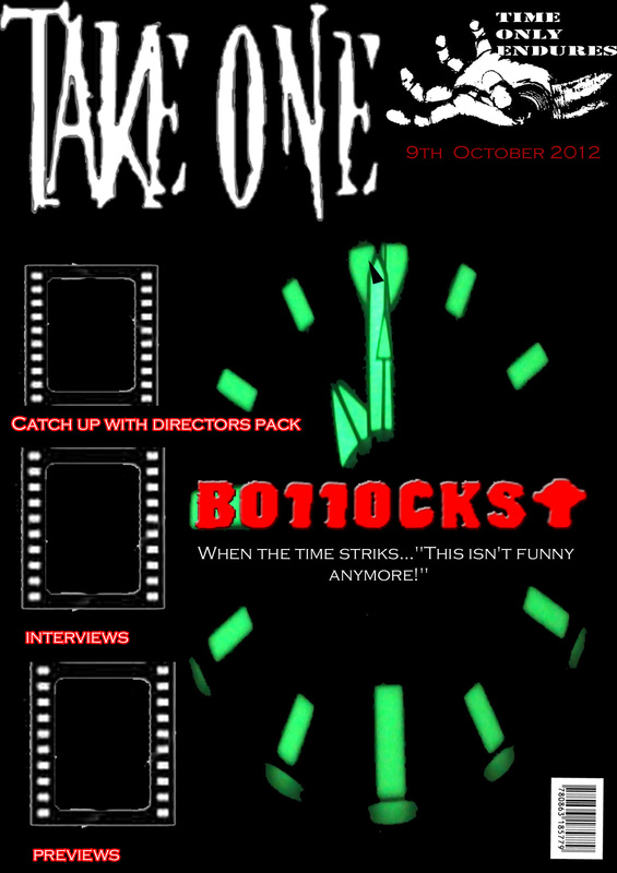
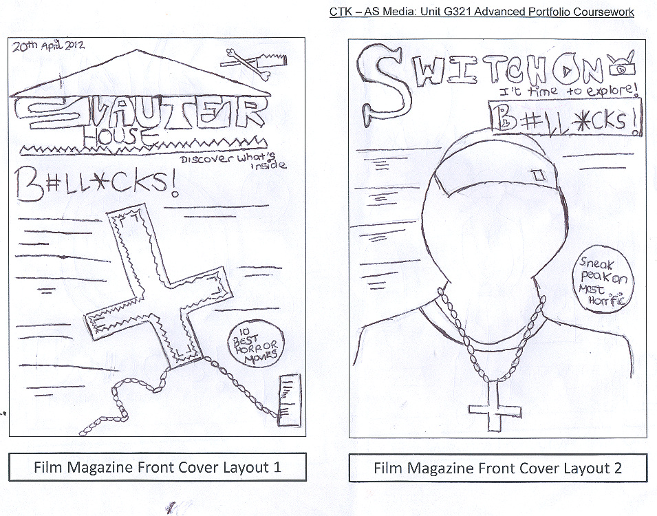
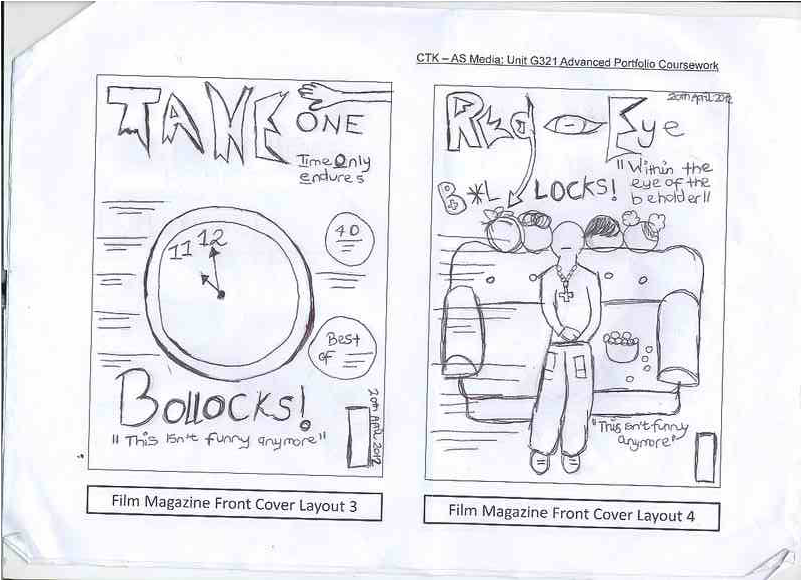
This is the first draft of our magazine. The masthead is titled "Take One"; it very daring and bold. The font of the masthead is horror from the website 'Da Font', which resembles zombie claws, scratched against a chalk board.
The logo of the magazine links to the masthead, and the idea of taking with you're hand. The logo is a image of a zombie's hand, which connects to the horror genre. The title of the film 'Bollocks', is designed in red to symbolize red blood and to differentiate from the other subtitles on the page. The positioning of the title is in the center of the page - this is to create less of a compacted page. The title 'Bollocks', is in front of the clock, because these are the principal and main representation to illustrate the film, another reason for the title's positioning. One negative thing about the masthead is the layout; it would have looked better if it was placed in the center, rather than in the corner to one side.
The logo of the magazine links to the masthead, and the idea of taking with you're hand. The logo is a image of a zombie's hand, which connects to the horror genre. The title of the film 'Bollocks', is designed in red to symbolize red blood and to differentiate from the other subtitles on the page. The positioning of the title is in the center of the page - this is to create less of a compacted page. The title 'Bollocks', is in front of the clock, because these are the principal and main representation to illustrate the film, another reason for the title's positioning. One negative thing about the masthead is the layout; it would have looked better if it was placed in the center, rather than in the corner to one side.
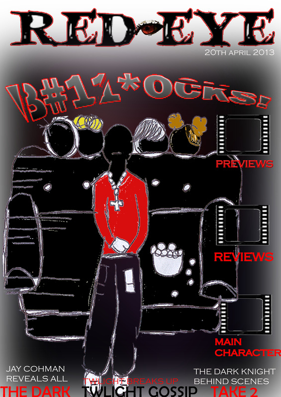
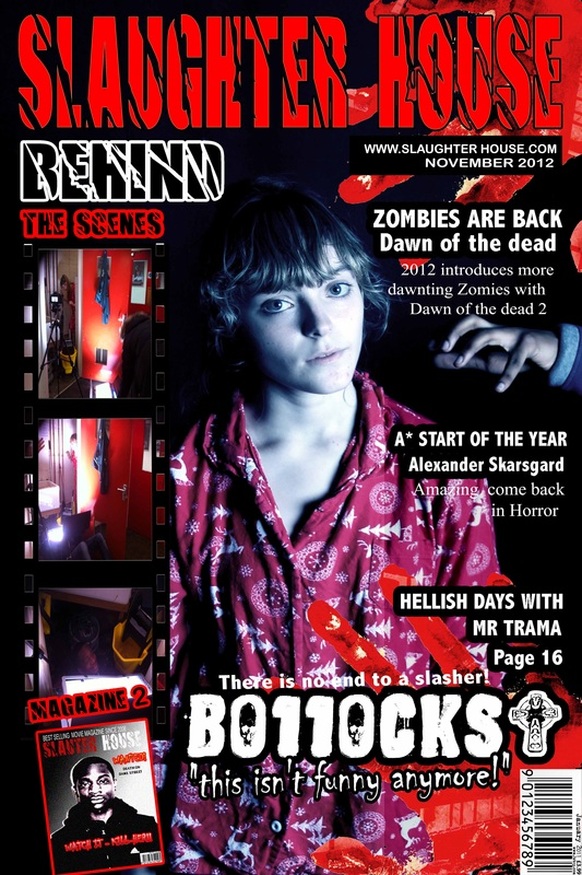
This is our second draft of our movie magazine. The masthead is titled 'Red Eye'; this follows conventions of a horror.The name 'Red Eye', is normally associates with Demons or zombies, with red eyes. The logo is a image of a red to eye, supporting the Masthead. The image illustrates what would be the characters with our trailer sitting on the sofa in long shot. The title of the film has slashes across the text, to portray knife slashes and, that this film is a Slasher.
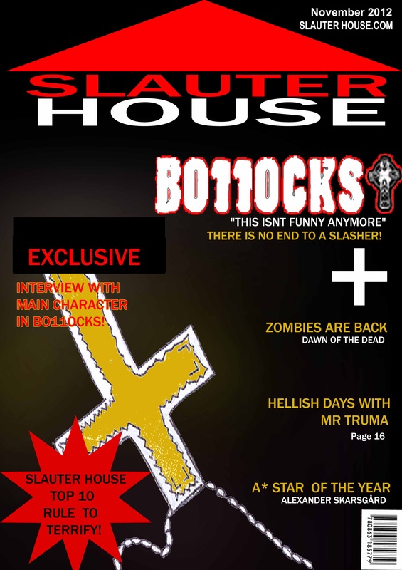
Above is our third magazine draft - the masthead of the magazine say's 'Slaughter house', this title follow the conventions of being a horror magazine. The text is colour in red, to symbolize death and blood in a 'slaughter house'. The red triangle above the text supports the masthead, and is a representation of a roof top on a house. Here was used the rosary cross, as it is the main feature which is symbolic within our trailer, to identify who the mystery killer is.
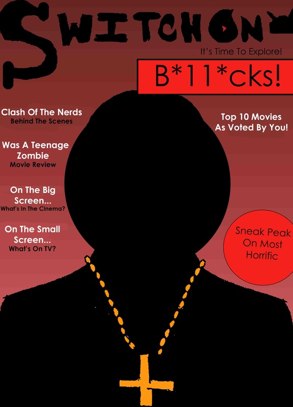
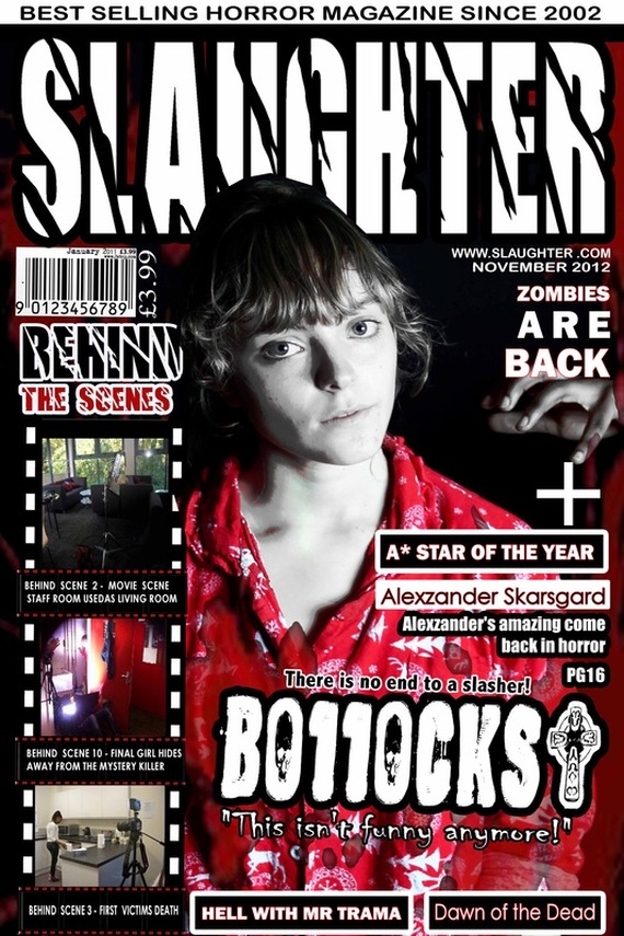
Here above our masthead is titled 'Switch On', which advertise our film titled 'B*11*cks!' (Bollocks). The selling line of magazine 'is 'It's Time To Explore!', gets audiences intrigued to buy the magazine. The magazine front cover intends to show a medium close up of the antagonist of the film, called Desmond.
Mock up - Beginning to create final magazine and poster
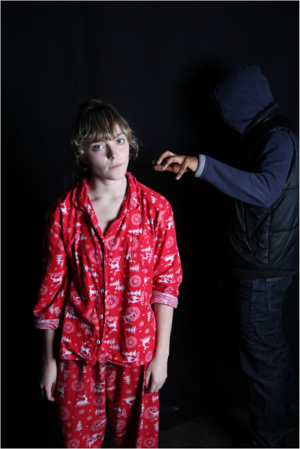
Here is the image we are going to use in our magazine - this image is a long shot to capture the whole length of her, being approached by mystery killer. We decided not to do a close up shot of the final girl's face, like most magazine (horror magazine's), because we wanted to capture her frame and "petiteness'", to illustrate her being innocent and "tame". The mystery killer's posture supports that idea of the audience not knowing which one of the hooded boys was the killer. We put this picture against black, so when editing the picture on photoshop it is less complicated - the black background could also be used for the final products, as it follows conventions again.
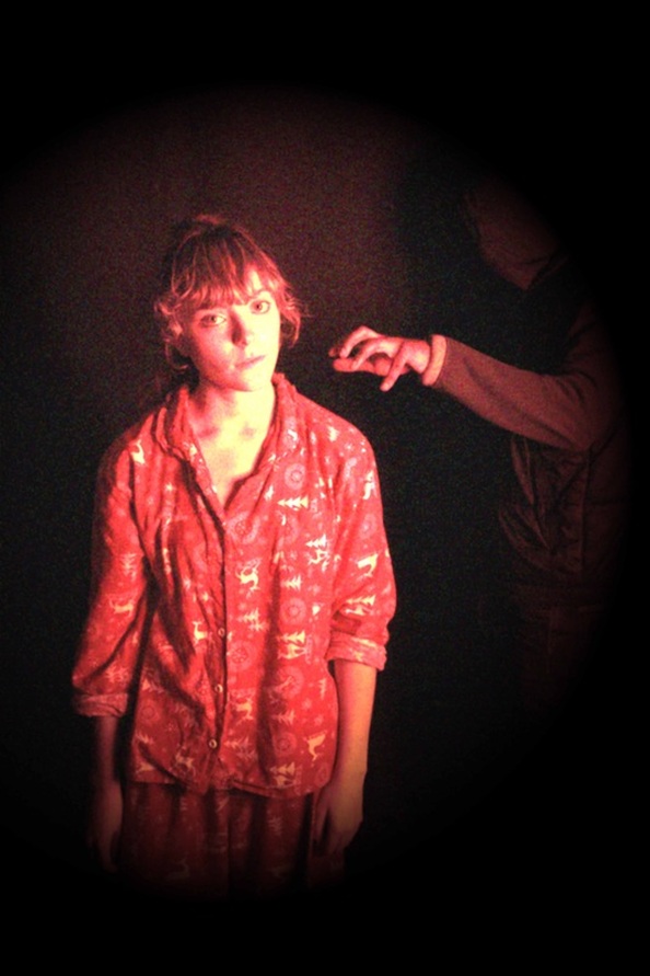
Effect and lighting was added to the picture on photoshop.
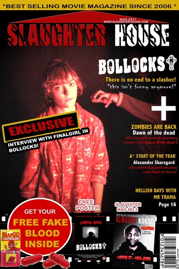
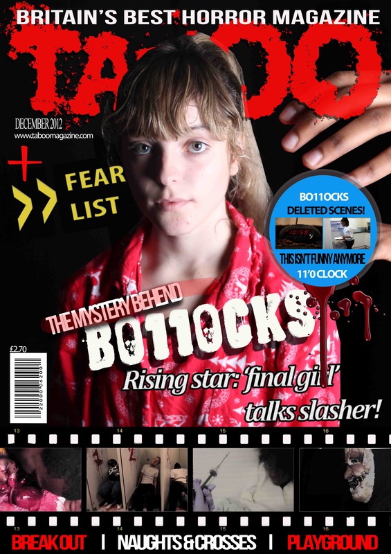
Down below is our fictional horror-based magazine titled, 'SLAUGHTER'. As you can see our magazine followed the conventions of existing magazines such as; thee usage of the masthead, which is the title of the magazine, so ours is 'SLAUGHTER'. A tagline/selling-line to help promote the magazine (i.e. "Best Selling Horror Magazine Since 2002") is what our tagline is. A barcode, though it is not mandatory to include the barcode on a magazine front cover, however we as a group decided to include a barcode to make the magazine look real. We also included a price, which most existing magazine front covers have to let the reader know how much the magazine costs. A website, which some magazines front covers have. A date, which is important for a magazine to have on the front cover, so the reader can know if the issue of the magazine is current. We also includede some taglines, which is again important for magazines to have, so the reader can know that there other stories/topics included inside the magazine. Also important, is the main-coverline, which like the masthead, has to stand out from all the other font (i.e. coverlines) of the magazine, to indicate that main image of the magazine front cover relates to the main coverline. We also included other images on the font cover, which some existing magazines tend to have, because they try to use all the space there is on the front cover. The other images on the front page of the magazine are normally placed to sides or at the bottom, and they also include a border around them, to avoid the confusing the reader. The colours that we used for our magazine are black, white and red, the colours that mostly associated with horror.