
Poltergeist - Movie Poster Textual Analysis
The Film Title: Poltergeist
Year of Release: 1982
Director: Steven Spielberg
Production/finance company: Metro-Goldwyn Mayer
Principle Cast: JoBeth Williams, Heather O’Rourke, Craig T. Nelson
Film Origin/Info: Franchise, digitally restored version
Synopsis
The Freeling family have just moved into a new home in a peaceful suburban estate. Strange things start happening (i.e their pet canary dies, storms occur and Carol Ann – the youngest of the family – becomes attached to the television. This continues and Carol Ann warns her family that “they’re here”, meaning the ‘TV people’. She is then sucked into the television set entering a whole new dimension.
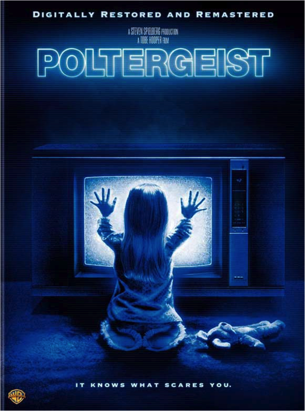
The image is presented to us in low-key lighting and the only source of light is coming from the glow of the television, suggesting that this is the center of the action for the film ‘Poltergeist’.
The poster does not give away much about the fiIm as we see only a television and a girl. The room is dull with plain walls and this connotes that the setting is insignificant – we must focus only on the subject and the television.
In the midst of the dim and dark setting, a young blonde girl kneels in front of the television set. This non-verbal communication and the posture in which she is sitting would be considered unnatural for a child of her age, or anyone for that matter. Her hands are pressed onto the screen as if there is a connection between her and the television in such a way that she can not detach herself. This is unusual behaviour for a child as little girls would normally be perceived to pay more attention to stuffed toys and dolls - much like the teddy bear that has been laid on the floor next to her. This particular prop reinforces that the child is normal - or was normal – at one point as girls are commonly associated with being inseparable with their toys. Rather than that, this child seems disinterested in the toy and more fascinated or drawn to the television which would usually be associated with an adult or teenager.
We see little detail in the costume choice however it the slippers suggest that she is in her pajamas meaning most of the action will occur at night. Darkness and night time are gothic features that are significant in most – if not all – horror films. The costume also reinforces the fact that the main subject is a young child connoting innocence which draws the audience further as no child deserves to be harmed.
By arranging the poster in such a way that the main subject in the long shot is not facing us, the poster itself holds ambiguity and prepares us for the uncertainty we will experience when watching the film.
The image is presented in a neutral view rather than a high or low angle and this could suggest that what happens to the young girl could happen to anyone, despite age, class or gender etc. As well as that it can connote that the subject is not particularly vulnerable nor is she strong thus making it all the more interesting. We are not looking down at the girl or looking up to her which could suggest that during the film we will be experiencing it from her point of view or seeing things through her eyes.
The poster uses different shades of blue for illustration, and no other colour is present. The blue light takes over the entire image much like the television does. With blue we usually associate sadness or the cold and perhaps both are present in the film. As well as this, the colour eliminates violence and death as themes and sets itself out to be more of a sci-fi or psychological horror rather than slasher or splatter, making this very clear to on-lookers and following conventions of their chosen genre.
The sans serif font used connotes a more modern feel to the film and reinforces the idea of science-fiction that may be present. The tagline reads, “It knows what scares you” in small capital letters and the pronoun used is ‘it’ rather than ‘he’, ‘she’ or ‘they’. This reinforces the idea of sci-fi or even the monster-horror genre as well as increasing obscurity. There are no quotations or cast names which suggests that the director – Steven Spielberg – is hoping for the potential audience to focus on the plot itself as anything else would make it seem less real. Together, the minimalistic poster keeps the film a mystery as well as sparks interest in those who see it.
The Final Destination - Movie Poster Textual Analysis
Film Title: The Final Destination
Year of Release: 28 August 2009 (UK)
Director: David R. Ellis
Production/Financing Company: New Line Cinema, Practical Pictures, Flipzide Pictures and Parallel Zide.
Principle Cast: Bobby Campo, Shantel VanSanten, Nick Zano, Haley Webb, Mykelti Williamson, Krista Allen, Andrew Fiscella, Justin Welborn.
The script for the first movie was originally written by American screenwriter Jeffrey Reddick as an episode of ‘The X Files’ an American science fiction drama television series.
The final destination is part of a film franchise that is final destination.
In a car race in McKinley Speedway, twenty-something Nick has a premonition of a deadly car crash with many casualties in the audience and convinces his girlfriend Lori and his friends Hunt and Janet to leave the place. They are followed by the security guard; a racist guy; a mother with her children and a mechanic, that are saved from death. When the racist guy and the mother die in mysterious and creepy incidents, Nick and Lori research and find many similar cases in Internet. They try to lure The Ripper to break the chain of deadly events and survive, but destiny does not help them.
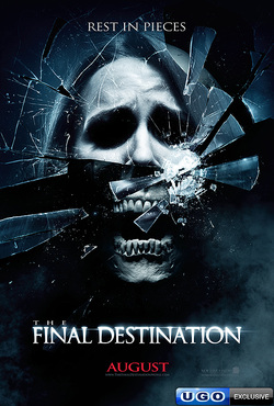
The lighting in ‘Final Destination’ Poster is very gloomy (with low-key lighting) which connotes mystery as they do not want too much to be given away. In terms of NVC the woman’s face coveys an expression of “Arghhhhh” which connotes that she is terrified. In this image we are not shown the costume this is probably that the production company wants to give a sense of the unknown as this could be the monster. Props that were probably used were a smoke machines as spoke appears in the bottom left of the poster; this could furthermore portray the side of mystery. The shot is a medium-close up.
The main image is of a Caucasian, blonde women. The main image connotes to me a woman through a fragmented mirror; the skull could be her real fate which she is trying to hide from, but by looking at herself in the mirror she finds out what is coming her way, death. The shattered seems to have a shot gone through it, as the area looks shot. The eyes are darkened in the poster and this could add to the mystery, so we have to find out who the girl is and what her purpose in the film is going to be, also the character seems to be a protagonist as she is portrayed as the victim in the situation.
The composition of the image is centralized as the image largely stands out in the center. The image used is also asymmetric as the characters hair and “Jaw” is uneven on each side. In addition, the shot is focused on the main image, so that the target audience draw their eyes to the distraught image first, intriguing them to read the listed information.
The poster has a blue look and tone to it, this is used to convey a message, so as blue connotes strong and important this is what they want their target audience to feel. However, the color also suggests peace which is a complete binary opposite to the skull that connotes death. Another colour that is used is white, which means innocence and the fact that this colour is not overwhelming could show that there is little innocence. The text “August” is in red which connotes passion and love, probable indication that the audience will love and passionate about the release of the film.
“Rest in pieces” anchors and helps the audience to understand the context of the image, definitely posing that there is going to be death inside the film, this is also the tagline and is a very strong statement (juxtaposes with the normal, Rest in Peace), suggesting to us that it is considered to be part on the slasher genre as the killer is likely to not kill them as a whole but chop them off somehow. Furthermore, the title itself anchors the image as “The final destination” could be seen as death and what carries on after.
The font used in the whole of the poster is sans serif font and connotes that the film is going to have a very modern feel to it and in the near current era. This particular film poster follows the convention of a horror film as it is captivating, has a focal picture that is intriguing, it has a large title that can be easily read. The mood of the poster is dark and evil, the purpose that can be conveyed is to scare the target audience due to the skull in the main image this conducts a new presence of fear and anxiety in the targets audiences mind.
In the poster there are no names above the Title and the woman portrayed cannot be made out, why? This is probably to show the character is unknown, and the producers have wanted to sell the image, instead of the actors and the fans that come along with them, thus selling other than the cast.
“August” is the film’s release date which can be seen as a teaser as it does not reveal the date or even the year. The overall mood of the magazine allows me to deduce that the poster is a teaser as it does not want to reveal much, but if you have watched any final destination film, you would know that the plots are similar; not releasing much could simply be a way of getting the audience to watch their new film.
Year of Release: 28 August 2009 (UK)
Director: David R. Ellis
Production/Financing Company: New Line Cinema, Practical Pictures, Flipzide Pictures and Parallel Zide.
Principle Cast: Bobby Campo, Shantel VanSanten, Nick Zano, Haley Webb, Mykelti Williamson, Krista Allen, Andrew Fiscella, Justin Welborn.
The script for the first movie was originally written by American screenwriter Jeffrey Reddick as an episode of ‘The X Files’ an American science fiction drama television series.
The final destination is part of a film franchise that is final destination.
In a car race in McKinley Speedway, twenty-something Nick has a premonition of a deadly car crash with many casualties in the audience and convinces his girlfriend Lori and his friends Hunt and Janet to leave the place. They are followed by the security guard; a racist guy; a mother with her children and a mechanic, that are saved from death. When the racist guy and the mother die in mysterious and creepy incidents, Nick and Lori research and find many similar cases in Internet. They try to lure The Ripper to break the chain of deadly events and survive, but destiny does not help them.
The lighting in ‘Final Destination’ Poster is very gloomy (with low-key lighting) which connotes mystery as they do not want too much to be given away. In terms of NVC the woman’s face coveys an expression of “Arghhhhh” which connotes that she is terrified. In this image we are not shown the costume this is probably that the production company wants to give a sense of the unknown as this could be the monster. Props that were probably used were a smoke machines as spoke appears in the bottom left of the poster; this could furthermore portray the side of mystery. The shot is a medium-close up.
The main image is of a Caucasian, blonde women. The main image connotes to me a woman through a fragmented mirror; the skull could be her real fate which she is trying to hide from, but by looking at herself in the mirror she finds out what is coming her way, death. The shattered seems to have a shot gone through it, as the area looks shot. The eyes are darkened in the poster and this could add to the mystery, so we have to find out who the girl is and what her purpose in the film is going to be, also the character seems to be a protagonist as she is portrayed as the victim in the situation.
The composition of the image is centralized as the image largely stands out in the center. The image used is also asymmetric as the characters hair and “Jaw” is uneven on each side. In addition, the shot is focused on the main image, so that the target audience draw their eyes to the distraught image first, intriguing them to read the listed information.
The poster has a blue look and tone to it, this is used to convey a message, so as blue connotes strong and important this is what they want their target audience to feel. However, the color also suggests peace which is a complete binary opposite to the skull that connotes death. Another colour that is used is white, which means innocence and the fact that this colour is not overwhelming could show that there is little innocence. The text “August” is in red which connotes passion and love, probable indication that the audience will love and passionate about the release of the film.
“Rest in pieces” anchors and helps the audience to understand the context of the image, definitely posing that there is going to be death inside the film, this is also the tagline and is a very strong statement (juxtaposes with the normal, Rest in Peace), suggesting to us that it is considered to be part on the slasher genre as the killer is likely to not kill them as a whole but chop them off somehow. Furthermore, the title itself anchors the image as “The final destination” could be seen as death and what carries on after.
The font used in the whole of the poster is sans serif font and connotes that the film is going to have a very modern feel to it and in the near current era. This particular film poster follows the convention of a horror film as it is captivating, has a focal picture that is intriguing, it has a large title that can be easily read. The mood of the poster is dark and evil, the purpose that can be conveyed is to scare the target audience due to the skull in the main image this conducts a new presence of fear and anxiety in the targets audiences mind.
In the poster there are no names above the Title and the woman portrayed cannot be made out, why? This is probably to show the character is unknown, and the producers have wanted to sell the image, instead of the actors and the fans that come along with them, thus selling other than the cast.
“August” is the film’s release date which can be seen as a teaser as it does not reveal the date or even the year. The overall mood of the magazine allows me to deduce that the poster is a teaser as it does not want to reveal much, but if you have watched any final destination film, you would know that the plots are similar; not releasing much could simply be a way of getting the audience to watch their new film.
Orphan - Alethia's Movie Poster Textual Analysis
· The Film Title: Orphan
· Year of release: 7 August 2009(UK)
· Director: Jaume Collet-Serra
· Production/Financing company: Studio Canal (financed in association with) (as Studiocanal), Dark Castle Entertainment, Appian Way, Studio Babelsberg Motion Pictures (produced in association with) and Optimum Home Entertainment (2009) (UK) (DVD) (Blu-ray)
· Principle Cast: Vera Farmiga, Peter Sarsgaard and Isabelle Fuhrman
· Synopsis: A husband and wife who recently lost their baby adopt a 9-year-old girl who is not nearly as innocent as she claims to be.
Conventions:
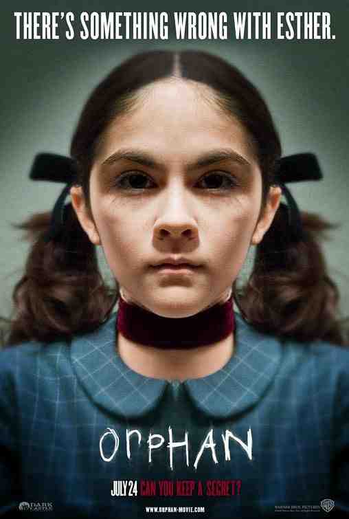
This horror movie poster only follows a few horror conventions. Firstly, the title is san serif and decorative. The font looks hand written, with either a pencil or charcoal; the sharp edges and thin lines suggest this. The font looks as if someone has forcefully and aggressively written the title of the film on the poster. This suggests that the font has horror traits, because horror films have a lot of physical anger portrayed, forceful and demanding events happening. Within the thriller genre there is a lot of suspicion and an intimidating characters. Another convention is shown through the little girl’s facial expression. The third convention is shown through colours. Most horror movies express dark and “gloominess”, which is symbolized through the colour grey, and also the colour red, within in the font which suggests blood.
Mood:
In this movie poster the mood expresses two different feelings. Firstly, it portrays suspicion and it also portrays innocence. The image used is a picture of a young girl, looking very neat and clean cut. She seems to be wearing what looks like uniform, which suggests she is a school girl. The lighting is directed from above her head and shone down on her; this is an imagery of an angel being thrown down from heaven. The girls face is in a close up shot and her facial expression is stern and serious. This suggests that she is not to be a person who is to be messed about with. Her facial expression, the lighting and her gender, creates two contrasting moods; one fearful and anxious and the other peaceful.
Font/Names:
On this poster there are no written names of the film stars, therefore it does not follow the conventions of a typical movie poster. The reason why there might not be any front names on this poster is, because they want to signify on the main aspects of the film and the most important information, such as close of shot of the main character, the film title, the date and the tagline.
The font on this poster is san serif. The reasons for san serif as the preferred font type, is because it is usually more clear to read rather than a Serif text and this type of font is mainly used for headlines.
Credits:
This poster does not reveal too much and has a limited amount of information on the page, and does not include the credits. This is most likely to get the audience to watch the movie and research about it and the movie credits.
Colour:
The colour scheme of this poster is very limited, the shadows and lighting is mostly used to create effect rather than colour. The colours that used are; grey for the background, blue, red as the font and the material around the character neck, white for the font, brown as the characters original colour of her hair and the characters skin colour. The colours used are simple and soft, to create an innocent, wary and scary feeling.
Tagline:
The tagline used is, “There is something wrong with Esther.” This phrase could either be a fact or an opinion, but considering that this is a horror movie poster it is most likely to be a fact. Esther, being the main character is
Quotes:
“Can you keep a secret?” is the quote used. It is a rhetorical question, which creates a feeling of scare, threat and worry. Not being able to questions or reply to this question would make the character(s) within this movie film venerable and controlled.
· Year of release: 7 August 2009(UK)
· Director: Jaume Collet-Serra
· Production/Financing company: Studio Canal (financed in association with) (as Studiocanal), Dark Castle Entertainment, Appian Way, Studio Babelsberg Motion Pictures (produced in association with) and Optimum Home Entertainment (2009) (UK) (DVD) (Blu-ray)
· Principle Cast: Vera Farmiga, Peter Sarsgaard and Isabelle Fuhrman
· Synopsis: A husband and wife who recently lost their baby adopt a 9-year-old girl who is not nearly as innocent as she claims to be.
Conventions:
This horror movie poster only follows a few horror conventions. Firstly, the title is san serif and decorative. The font looks hand written, with either a pencil or charcoal; the sharp edges and thin lines suggest this. The font looks as if someone has forcefully and aggressively written the title of the film on the poster. This suggests that the font has horror traits, because horror films have a lot of physical anger portrayed, forceful and demanding events happening. Within the thriller genre there is a lot of suspicion and an intimidating characters. Another convention is shown through the little girl’s facial expression. The third convention is shown through colours. Most horror movies express dark and “gloominess”, which is symbolized through the colour grey, and also the colour red, within in the font which suggests blood.
Mood:
In this movie poster the mood expresses two different feelings. Firstly, it portrays suspicion and it also portrays innocence. The image used is a picture of a young girl, looking very neat and clean cut. She seems to be wearing what looks like uniform, which suggests she is a school girl. The lighting is directed from above her head and shone down on her; this is an imagery of an angel being thrown down from heaven. The girls face is in a close up shot and her facial expression is stern and serious. This suggests that she is not to be a person who is to be messed about with. Her facial expression, the lighting and her gender, creates two contrasting moods; one fearful and anxious and the other peaceful.
Font/Names:
On this poster there are no written names of the film stars, therefore it does not follow the conventions of a typical movie poster. The reason why there might not be any front names on this poster is, because they want to signify on the main aspects of the film and the most important information, such as close of shot of the main character, the film title, the date and the tagline.
The font on this poster is san serif. The reasons for san serif as the preferred font type, is because it is usually more clear to read rather than a Serif text and this type of font is mainly used for headlines.
Credits:
This poster does not reveal too much and has a limited amount of information on the page, and does not include the credits. This is most likely to get the audience to watch the movie and research about it and the movie credits.
Colour:
The colour scheme of this poster is very limited, the shadows and lighting is mostly used to create effect rather than colour. The colours that used are; grey for the background, blue, red as the font and the material around the character neck, white for the font, brown as the characters original colour of her hair and the characters skin colour. The colours used are simple and soft, to create an innocent, wary and scary feeling.
Tagline:
The tagline used is, “There is something wrong with Esther.” This phrase could either be a fact or an opinion, but considering that this is a horror movie poster it is most likely to be a fact. Esther, being the main character is
Quotes:
“Can you keep a secret?” is the quote used. It is a rhetorical question, which creates a feeling of scare, threat and worry. Not being able to questions or reply to this question would make the character(s) within this movie film venerable and controlled.
Child's Play - Movie Poster Textual Analysis
Example Textual Analysis: Child’s Play Movie Poster
For my textual analysis I will be analyzing the Child’s Play movie poster.
Child’s Play:
Synopsis and Year of Release: “Chilling horror movie starring Catherine Hicks and Chris Sarandon, 1988. A child is the only one who knows that is new Chucky doll is possessed by the spirit of a dead murderer”.
Succeeded By: Child’s Play 2 and 3.
Directed By: Tom Holland.
Production/Financing Company: Metro Goldwyn Mayer (MGM) and United Artists.
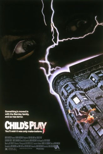
The ‘Child’s Play’ movie poster fits conventions of any other horror film posters with its usage of dark backgrounds, color schemes, lighting effects, and the films antagonist.
The ‘Child’s Play’ movie poster consists of an apartment building taken from a ground perspective. There is also a woman falling from the building.
Around the top edge of the building is a white glow of light to show that the lightening bolt is striking the building.
Above the building, you can see some very sinister-looking eyes. Very little detail is revealed due to the dark surroundings. This conceals the character’s identity, which is one of the main conventions of a horror poster: They conceal the identity of the character that is featured on the poster, which makes them a mystery to the target audience of film.
The look in the character’s eyes and the lightening on the film poster would possibly describe the mood of the film and the poster as to being dark, twisted, and psychotic.
The font used in the film poster is colored in both white and grey. The white font is used to highlight the selling-line and the film’s title. The grey font indicates the production details at the bottom of the film poster. However the second part of the film’s title, the word ‘play’ has blood smeared on the lettering, which is one of main conventions of a slasher-horror film, because they also involve blood.
The color scheme of the film’s poster are a mixture of light and dull colors, which brings out a harsh and chilling effect to the film poster, which is mostly one most conventions used in the color schemes of horror film posters, which they use light and dull colors to bring out a sinister effect and draw attention to viewers.
The film poster also consists of the tag-line and quote: “Something’s moved in with the Barclay family, and so has terror”, and “You’ll wish it was only make-believe”. This would be effective because it will make people curious about the film as a result of wanting to know what happen.
For my textual analysis I will be analyzing the Child’s Play movie poster.
Child’s Play:
Synopsis and Year of Release: “Chilling horror movie starring Catherine Hicks and Chris Sarandon, 1988. A child is the only one who knows that is new Chucky doll is possessed by the spirit of a dead murderer”.
Succeeded By: Child’s Play 2 and 3.
Directed By: Tom Holland.
Production/Financing Company: Metro Goldwyn Mayer (MGM) and United Artists.
The ‘Child’s Play’ movie poster fits conventions of any other horror film posters with its usage of dark backgrounds, color schemes, lighting effects, and the films antagonist.
The ‘Child’s Play’ movie poster consists of an apartment building taken from a ground perspective. There is also a woman falling from the building.
Around the top edge of the building is a white glow of light to show that the lightening bolt is striking the building.
Above the building, you can see some very sinister-looking eyes. Very little detail is revealed due to the dark surroundings. This conceals the character’s identity, which is one of the main conventions of a horror poster: They conceal the identity of the character that is featured on the poster, which makes them a mystery to the target audience of film.
The look in the character’s eyes and the lightening on the film poster would possibly describe the mood of the film and the poster as to being dark, twisted, and psychotic.
The font used in the film poster is colored in both white and grey. The white font is used to highlight the selling-line and the film’s title. The grey font indicates the production details at the bottom of the film poster. However the second part of the film’s title, the word ‘play’ has blood smeared on the lettering, which is one of main conventions of a slasher-horror film, because they also involve blood.
The color scheme of the film’s poster are a mixture of light and dull colors, which brings out a harsh and chilling effect to the film poster, which is mostly one most conventions used in the color schemes of horror film posters, which they use light and dull colors to bring out a sinister effect and draw attention to viewers.
The film poster also consists of the tag-line and quote: “Something’s moved in with the Barclay family, and so has terror”, and “You’ll wish it was only make-believe”. This would be effective because it will make people curious about the film as a result of wanting to know what happen.
