Fangoria - Magazine Front Cover Textual Analysis
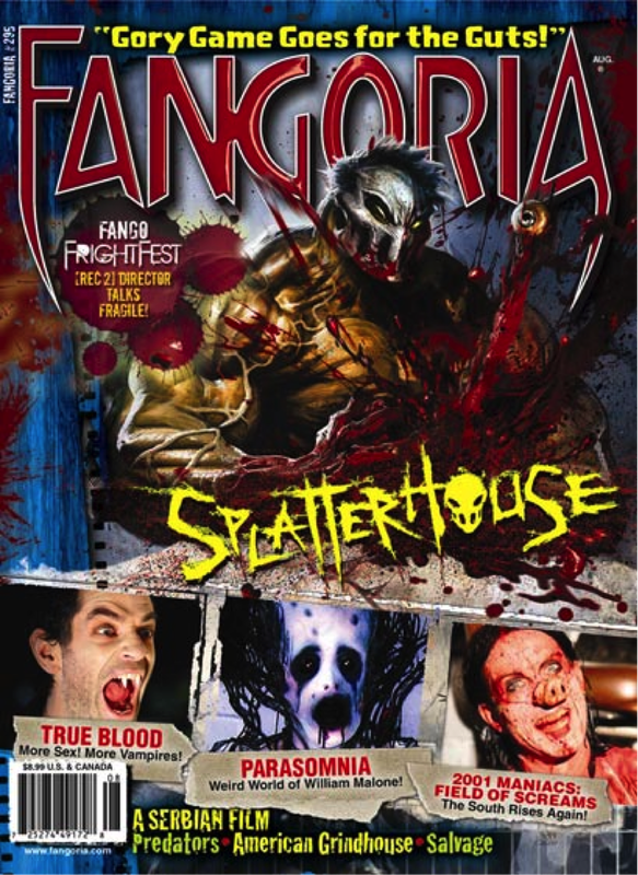
‘Fangoria’ is an American magazine that focuses on horror movies. This particular issue was primarily to promote ‘Splatterhouse’, a video game created by Alan Ball in 2010. When designing a masthead, it is important to take into account the style and the fact that it must appear recognisable as it will be the same on all issues. As well as this, the magazine above takes into account the conventions of a magazine. This is evident as they included a date line and barcode. However, this particular magazine must also stay true to the horror genre and there are many ways in which they do this. In this case, sans serif font has been used in the masthead in order to appeal to the modern and young audience that the magazine targets. The flicks on the letters ‘f’ and ‘a’ have sharp points, reminding us of violence and weaponry which is present in many horror movies – especially splatter and slasher sub-genres. ‘Fangoria’ is spelled out in glossy red font that resembles fresh blood which is significant to the genre also.
Arguably the most important part of the magazine, the main image, must stand out in the stores and grasp the customer as well as present the product and genre well. In this issue, the image is marketing ‘Splatterhouse’. Lighting in the image is surprisingly high-key as opposed to the common low-key lighting and darkness you see in horror movie promotions. However, this high-key lighting enables us – and forces us - to see exactly what is happening. Because the subject and image are both disturbing, this is almost scarier than darkness and uncertainty. The setting is merely a room painted blue with a metal sheet behind the subject. In front of the subject there is a white table covered in blood, reminding us of a butcher’s. It is clear that the setting must be particularly significant to the product as it is named ‘Splatterhouse’ and already we know that the product will include violent images. The subject itself is ambiguous unlike its surroundings. Wearing a metal mask means non-verbal communication is limited which evokes fear all on its own. The shape of the mask makes it look as though the subject is full of anger or frowning but his posture reveals a sense of control and strength both of which are highlighted through his monstrous hulk-like physique. The image was taken in such a way that we are looking up at the subject through a low-angle shot, giving him inferior power against us and thus enhancing how scary a character he is. The title ‘Splatterhouse’, is rough and looks as though it has been carved by a knife onto the cover. The sans serif font here is the colour yellow which connotes to us a state of being unnatural. As well as this a skull has been used in the place of the ‘o’. This is a unique design that presents the common theme of death within horror. The tagline for ‘Splatterhouse’ reads “gory game goes for the guts” and the alliteration cause this to stick in your mind, and so encourages the customer to purchase.
It is important for the magazine to show a sense of continuity and this is essential for all kinds. ‘Fangoria’ does this particularly in the taglines. Each cover-line has been placed on what resembles teared sugar paper. The dull colour and the rugged ripped pieces look rough and dirty which fit the genre well and the text is written in bold red font demonstrating a recurring theme in the front cover.
The other images are printed smaller at the bottom half of the magazine and these are important as they can show promote other products and therefore attracts more customers. In True Blood, the product is not ambiguous at all as it shows a vampire bearing his teeth. The customer does not need to use their imagination to figure out what True Blood is about and so if they are interested in vampires, they will immediately be drawn to ‘Fangoria’. ‘Parasomnia’ presents a disturbing and inhumane figure that is looking straight at the camera – and the reader – evoking fear and disturbance. Lastly, ‘Field of Screams’ demonstrates an even more disturbed character through non-verbal communication and props. This is evident through the way he is covered and blood with his head tilted to one side and a grin on his face – suggesting he is a killer himself. He’s wearing a pig’s nose which immediately makes us think of butcher’s and connotes violence and death. Through all the images, the magazine successfully presents a variety of horror movie styles, attracting a wider audience.
SFX - Magazine Front Cover Textual Analysis
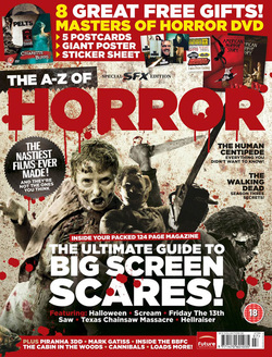
SFX is a British magazine known as ‘The greatest, Sci-Fi, fantasy and horror magazine on the planet’. This issue was a special edition ’The ultimate guide to big screen scares’. The masthead (logo) is a very important in allowing the target audience to recognise the brand, the masthead is often designed to captivate and is the same on every issue. The above magazine achieves this particular convention, however is also challenges it, this is because it is a special edition and the ‘SFX’ logo is smaller than usual, highlighting the significance of this special edition. The magazine takes into consideration the many conventions of a magazine; this is evident from the barcode and the publishing house logo. The magazine embodies the horror genre, this is portrayed by part of the masthead ‘Horror’ which is red and is dripping which resembles blood which is significant to this particular genre.
A selling line is important as it sets out its editorial philosophy, in this case its 'The A-Z of Horror' which is greatly capitalized and covers a lot of the magazine emphasizing its purpose.
It can be said that the most crucial aspect of a magazine is the main image; this is as it is used to grasp the audience’s attention, so that they are influenced to buy the magazine. This issue markets ‘The ultimate guide to big screen scares’. Lighting in the main image is low-key and follows the dark and mysteries mood brought to the table by horror movie promotions. The subjects are disturbing and are seen wielding weapons, connoting a slasher genre and anchoring the blood which maybe shed in a splatter film. The setting is a white wall stained with blood, from this I can deduce a meaning of corrupt purity, which maybe a theme in the movies promoted. There are three subjects in the main image, the character to the left’s Non verbal-communication (NVC) is almost predator-like, angry and in an attack phase/stance which invokes fear. The character second from the left’s NVC is very minimal due to the low-key lighting shown, however the low angle shot and the chainsaw (phallic symbol) expose power and strength which could be used to put the fear of God in the audience. Lastly, the image on the right, as this character has a mask which hides Non verbal-communications, but there is violence portrayed as the way the character is wielding a knife, also endorsing violence.
The text in the magazine is filled up with sans serif font; this generally implies the modernistic mood. All the text in the magazine is bold furthermore demonstrating a recurring theme in the front cover. The cover-line featured of the left third is shaped as a saw with sharp edges adding to the gore that will be included, as the left third is vital for marketing the magazine this will give customers a feel to the gene and horror lovers will be sure to pick up a copy! The reoccurrence of the colour red makes out continuity, and empowering the rigorous theme of blood.
There are other images featured, these are smaller and located at the top of the front cover, giving the target audience an extra incentive to buy the magazine as there are ‘8 free gifts’ included and also attracting a wider audience. True horror fans are likely to be drawn to the posters and the fee DVD included.
This particular magazine is very successful in portraying horror and making us know it is about the genre.
Entertainment Weekly - Movie Magazine Textual Analysis
Example Textual Analysis: Entertainment Weekly Front Cover
For my textual analysis I will be analyzing the front cover of Entertainment Weekly.
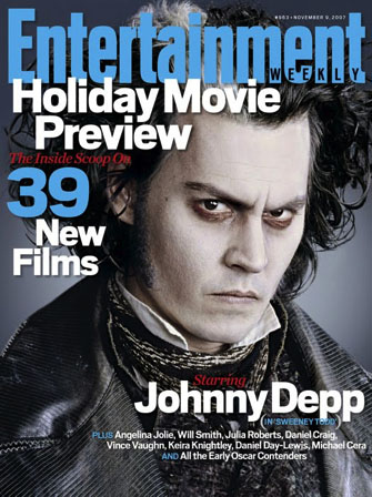
The front cover of the ‘Entertainment Weekly’ magazine consists of a medium close-up of the actor Johnny Depp (who serves as the magazine’s cover-person) as well as text that tells the reader different things about the contents of the magazine, which is helpful because it helps the reader know if they want to purchase the magazine or not.
The main cover-line of the magazine front-cover reads, “Starring Johnny Depp (In Sweeney Todd)”, which obviously makes reference to the Sweeney Todd film. Fans of the film, or Johnny Deep, would be interested as a result of the main focus being on him and the film and as a result would want to buy the magazine to read all about it. The main cover-line that supports the main image on the front cover of the magazine is written in three colors which are; red, white, and blue.
The Entertainment Weekly masthead is very distinctive. The color that is used for the word ‘Entertainment’ for this issue is blue, which makes it distinctive from the other text on the front cover because it’s a different color from them as well as a different size. This makes it much more appealing to the target audience of the magazine because it stands out and clearly shows that it is magazine about movies.
The number ‘39’ is also emphasized this way to highlight what’s inside the magazine to the reader. It tells the reader that there are “39 new film” reviews inside, which is interesting to the audience because it shows that the magazine has detailed information on films that they may want to see. It also highlights that this is a movie-theme magazine to the audience even more.
The word ‘weekly’ on the front cover is placed inside the last four letters of ‘entertainment’. The color that is used for the word ‘weekly’ is black, which makes it stand out from the masthead. This is important for the new readers because it highlights the fact that the ‘The Entertainment Weekly’ magazine is released every week even more.
Like any other magazine, this magazine has a dateline, which is placed above the masthead on the top right hand corner of the front cover. This issue was released November 9th 2007, and the issue number of the magazine is 963. The size of the dateline is small because it’s not very important to know when it’s compared to the other text on the magazine. If it was bigger, it would clash with the other text on the front cover of the magazine. However, it’s still there because it can be useful for people to know when it was issued.
The Entertainment Weekly magazine also makes use of cover-lines which are distributed over the main cover image. The color scheme of the cover-lines stand out differently from each other as some of the them are colored blue, some in red, and some in white. However, parts of the cover-line are highlighted red, and appear to be written in a serif style font, whilst the fonts that are highlighted blue and white remain the same as the masthead. By this I am assuming that whoever designs the front cover of the magazine wanted to use a different font style for some parts of the cover-lines, so the front cover of wouldn’t be boring or parts that are just not interesting enough.
The left third of the magazine front cover is important for sales in shops where the magazine is not shown full-frontage. This would mean that the title must be noticeable in a display of masses of rivals. The start of the masthead is vital here, as are short cover lines that are easy to read.
Most magazines place bar codes on the front cover, whilst others choose to place behind the magazine, like this one.
For my textual analysis I will be analyzing the front cover of Entertainment Weekly.
The front cover of the ‘Entertainment Weekly’ magazine consists of a medium close-up of the actor Johnny Depp (who serves as the magazine’s cover-person) as well as text that tells the reader different things about the contents of the magazine, which is helpful because it helps the reader know if they want to purchase the magazine or not.
The main cover-line of the magazine front-cover reads, “Starring Johnny Depp (In Sweeney Todd)”, which obviously makes reference to the Sweeney Todd film. Fans of the film, or Johnny Deep, would be interested as a result of the main focus being on him and the film and as a result would want to buy the magazine to read all about it. The main cover-line that supports the main image on the front cover of the magazine is written in three colors which are; red, white, and blue.
The Entertainment Weekly masthead is very distinctive. The color that is used for the word ‘Entertainment’ for this issue is blue, which makes it distinctive from the other text on the front cover because it’s a different color from them as well as a different size. This makes it much more appealing to the target audience of the magazine because it stands out and clearly shows that it is magazine about movies.
The number ‘39’ is also emphasized this way to highlight what’s inside the magazine to the reader. It tells the reader that there are “39 new film” reviews inside, which is interesting to the audience because it shows that the magazine has detailed information on films that they may want to see. It also highlights that this is a movie-theme magazine to the audience even more.
The word ‘weekly’ on the front cover is placed inside the last four letters of ‘entertainment’. The color that is used for the word ‘weekly’ is black, which makes it stand out from the masthead. This is important for the new readers because it highlights the fact that the ‘The Entertainment Weekly’ magazine is released every week even more.
Like any other magazine, this magazine has a dateline, which is placed above the masthead on the top right hand corner of the front cover. This issue was released November 9th 2007, and the issue number of the magazine is 963. The size of the dateline is small because it’s not very important to know when it’s compared to the other text on the magazine. If it was bigger, it would clash with the other text on the front cover of the magazine. However, it’s still there because it can be useful for people to know when it was issued.
The Entertainment Weekly magazine also makes use of cover-lines which are distributed over the main cover image. The color scheme of the cover-lines stand out differently from each other as some of the them are colored blue, some in red, and some in white. However, parts of the cover-line are highlighted red, and appear to be written in a serif style font, whilst the fonts that are highlighted blue and white remain the same as the masthead. By this I am assuming that whoever designs the front cover of the magazine wanted to use a different font style for some parts of the cover-lines, so the front cover of wouldn’t be boring or parts that are just not interesting enough.
The left third of the magazine front cover is important for sales in shops where the magazine is not shown full-frontage. This would mean that the title must be noticeable in a display of masses of rivals. The start of the masthead is vital here, as are short cover lines that are easy to read.
Most magazines place bar codes on the front cover, whilst others choose to place behind the magazine, like this one.
Alethia's
Movie Magazine Textual Analysis
Masthead (Logo)
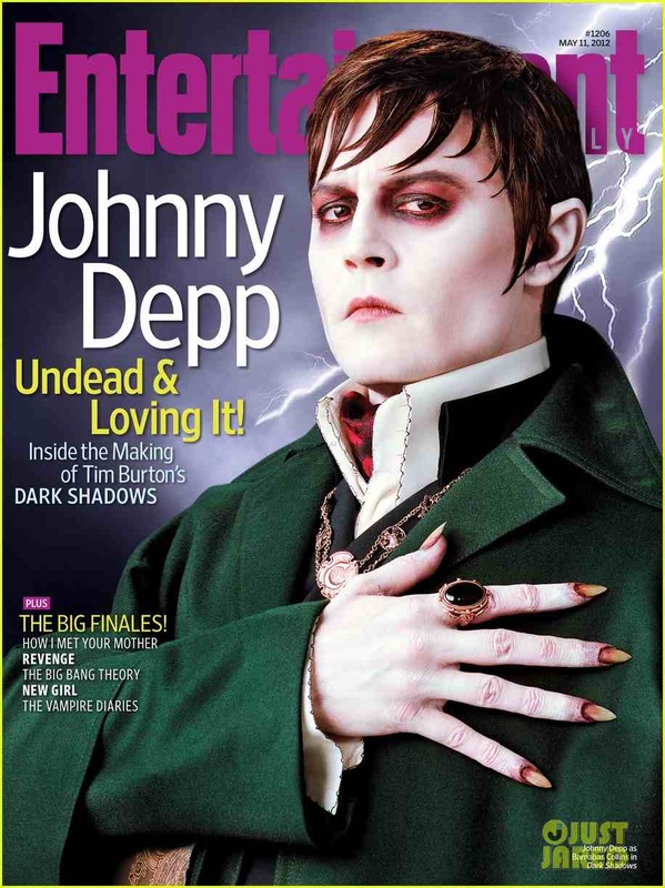
The masthead is san serif and placed at the top page, underneath the characters head. The colour used for the masthead pinkish purple, this compliment the background colour, and stands out against the other text colours. The style of the masthead is very plain and simple and it has no picture logo. The connotation of the masthead, ‘Entertainment’ is to interest audiences.
Dateline
The date line on this horror movie front cover is placed at the top, right hand corner of the masthead in small font. The colour of this is typed in black, published on May 11th of 2012. Above the date is a hash key and beside it is numbers.
Main Image
The main image of this horror magazine features a close – mid shot of Jonny Depp, an American Actor. The composition of his posture is very straight and proud. His face is slightly turned away from the camera and his eyes are glaring, sternly into the camera.
His has his hand on his chest to represent and his fingers are spread out around his chest.
His face messages a strong, bold and determined, powerful mannerism. His facial expressions portray a very stern, but also a sly look, with he’s pupils drifting across into the camera, as if he is warning someone not to mess with him. He is wearing rich looking garment. The jacket is a royal green and inside of his jacket is a white, pristine shirt. He is wearing a black gemstone ring; this suggests royalty and possession of evil.
Model Credit/Main Coverlines
The model credit is printed in bold white writing, written ‘Jonny Depp’. The type of font is san serif; his first name is written first and his second name written underneath. The cover lines colours are split between two colours; yellow and white. The tile of the two cover lines are printed in yellow and the sub cover lines are printed in white.
Left Third
Barcode
On this movie magazine cover there is no visible barcode.
Selling Line
The selling line on this magazine is, “Undead and Loving it”. This draws the audiences’ attentions and makes them want to be engaged with magazine stories.
